Boss Hugo Boss give us a new reference to display our books collection in the house. Instead of arrange them in the usual horizontal rack, this German brand creates two symmetrical racks that look not only modern but also artistic.
Friday, August 30, 2013
Thursday, August 29, 2013
Suite Blanco: Photo studio
Looking at the properties exist inside the Suite Blanco window display, we can exactly know what concept is use to arrange this season's display. There is no need for me to explain further about it because you can observe this very simple display that is done in very nice execution.
Wednesday, August 28, 2013
Pull & Bear: Map of the world in 3D
Pull and Bear might be only a fast fashion label for the young at hear people, but it has a serious concept of window display that can compete with those high end fashion houses. Map of the world become the concept for this season's display. This map, however, is made of layers of wood that are carefully and excellently set to look like a 3D map. There are original-design-aeroplanes, also made of wood, flying around in the ceiling to add the spirit of travel. I hope to find another continent map from other Pull & Bear stores in Jakarta.
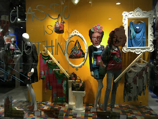
Desigual: Playing on classic
There is a statement written in the glass window of Desigual, 'Classic is Nothing', that might reflect the point of view of this Spanish brand. Inside the window display, classical or Baroque style frames are hung so freely and abruptly mixed up with the wooden clothing rail rack. There are also two Roman pillars, cut to serve as the table display for the handbag collection. The main point of attraction of this playing on classic is the funny interpretation on some iconic people that are Frida Kahlo and Marilyn Monroe for the women window and also a Greek sculpture face and Albert einstein for the men. Their famous faces are painted with moustache or heart sign and even Albert got his tongue out and wearing colorful headdress.
Friday, August 16, 2013
Jade: Punk
This year's Costume Institute Exhibition held by Vogue magazine and Metropolitan Museum of Art has the striking title of Punk: Chaos to Couture. The title shows all the meaning and concept of this influential fashion exhibition. Many designers, especially American, created the punk-influenced pieces or collections for their Fall/Winter 2013 and also we can see the rising of grunge fashion via Saint Laurent collection this fall. The influence of this trend reaches Indonesia, too, although not as big as other fashion conscious countries. We can see it in via the window display of Jade at Plaza Indonesia. Giant studs, so tightly placed they look like durian fruit, in white color become the backdrop for three mannequins set in the punk style outfit. There is a punk queen here with crown made of wire, skull necklace, and a gown by Azzedine Alaia that comes in black color. Her two lady-in-waiting have spiky hair, so long they look like hedgehog, and wear stockings to cover their face. Last but not least, chain and safety pin are completing the look of those mannequins. Amazing !
Thursday, August 15, 2013
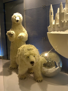
Lotte Dept. Store: Beauty and the bears
The Korean wave is emerging and rising not only in the cultural field but also in the retail business as well. Lotte Co. Ltd, the biggest player in food and retail business in South Korea is spreading its wing in Asia especially in the South East area like Indonesia. There are many supermarkets, restaurant (called Lotteria), Lotte Duty Free Store, and now Lotte Department Store. This new department store was opened last two month at Ciputra World Jakarta, also a new up market shopping mall in Jakarta. Becoming the anchor tenant for this mall, Lotte Dept. Store offers a wide arrays of fashion and beauty products both for male and female customers. Unfortunately, the big area of the dept. store is not supporting the existence of window displays, that in my expectation will be great to feature Korean pop culture influence in it. In fact, there are only big window displays in on the end corner per each floor.
One of the visible and strategic window display is located at the back end lobby of the mall. It features a very interesting concept of display that takes us to a magical land. A mannequin, female one, stands and acts as the queen of this icy and snowy land. Her companions are cute white polar bears that are still looking active yet so tame, even you can see the tiaras in their heads. There are also some floating globes around them with two of them are featuring a very detailed and excellently done castle miniatures. Hope to see another interesting and creative concept like this in the future.
Cartier: Panther in Paris
Panther is the animal that is closely related to Cartier thanks to the success of Panthere de Cartier jewelry collection. Many Cartier marketing images or video are featuring this wild and dangerous animal in a very elegance mood. The window display of Cartier at Plaza Indonesia, for example, is now decorated with golden panthers in each space. This creature is roaring up and down in the city of Paris that appear in the form of abstract and graphic properties.
Wednesday, August 14, 2013
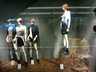
Stradivarius: The gloomy fall
The fall season situation is already strongly happening inside the Stradivarius window displays. One side of the window shows a group of mannequins gathering on a pile-of-woods covered grounds with some empty cages on the corner. Dried branches of pine tree is there to complete the gloomy atmosphere. The second window shows another group of mannequins stands inside a, perhaps, deserted house. Broken table with ruined chair next to it becomes the center of attention, while the grand curtains are looking very old thanks to the vanishing motif they have. The pine tree branch make an appearance here once again.
Tuesday, August 13, 2013
Bottega Veneta: New location
The second Bottega Veneta boutique in Jakarta has already moved to its new location, Plaza Indonesia. The new boutique has a new look that never existed before in this country. You can see the unfinished concept of the front wall with rows of rectangle stone motif. The upper part of this concrete wall is covered by black metal frame with visible round stud, make this store looks like a mini strong, but beautiful, fort. The window display looks very functional with mini rooms to store the fabulous intrecciato handbags and other leather goods.
Versace: New look
As long as I live in Jakarta, never did I see any change made in the Versace window display, except for the outfit change of course. There are always those mirrored black walls and matching black tile in the ground. However, last week i am very surprised to find that those black things are already changed with the white coverage both for the wall and the tile. The concept is still minimalist to anticipate the maximal-ist concept of the clothes. There are no other properties in sight as usual, only the infamous Medusa coat of arms that is very identical with this Italian brand.
Subscribe to:
Comments (Atom)


